TurboBranding
for ANC pharmacy chain

ANC is...
ANC is a chain of low-cost pharmacies. "ANC Pharmacy", "Kopiyka Pharmacy" and "Shar@ Pharmacy" - the leaders of pharmaceutical retail market, having in its stock more than 900 store in 130 cities and servicing more than a million customers every year.
Furthermore, ANC is one of the most modern pharmacy chains in Ukraine, implementing the latest innovations for the comfort of their customers. Thus, in order to speed up the service process, ANC uses a robotic supply of goods, meanwhile their salesrooms are equipped with tablets for quick ordering.
No doubts, today ANC is a progressive pharmacy in matters of quality service and technical innovations.
However, the company hasn’t been daring to update their communication for a long time. The slogan of ANC chain "Solutions to big and small problems" along with the famous image of a young woman and a girl, wearing doctors' suits, has not changed for 10 years. But finally it’s a high time for "big and small" image changes, as well as for new communication strategy.
Brand (re)Vision
In order to get to know ANC brand better, our team carefully studied all the processes of this pharmacy chain. After a while we made sure how much they care about health, comfort and benefit of their customers. That's really cool, because care is that very thing, that each of us wants to feel during a visit to the pharmacy. Therefore, we decided to set up the new communication strategy on the basis of the relevant brand archetype - "Caring".
New Strategy
The definition of the archetype helped us to embody the values of ANC brand in its communication. Thus, the feeling of care is transmitted in all its aspects:
- For a more effortless communication between pharmacy and its customer, we’ve chosen a relevant tone of voice - friendly and open.
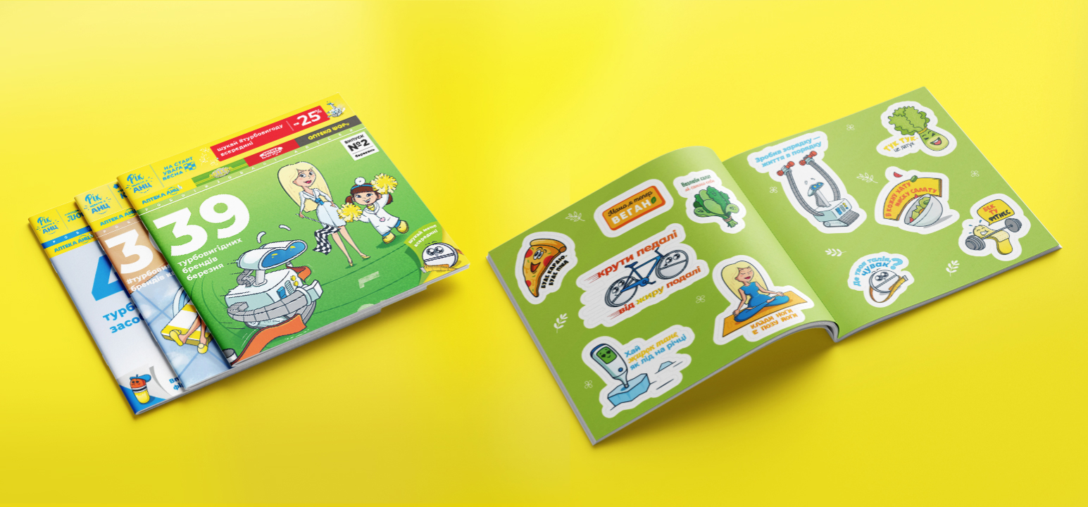
- Even more, we've also developed new and noticeable communication message for ANC - #turbobenefit. Thus, we inform about lots of turbo-offers for ANC customers, as well as emphasize turbo-prompt service of the pharmacy chain.
- In addition, depending on a certain month, ANC uses new creative messages in brand communication. They help to highlight one or another season according to a particular holiday or special offers for clients: "Love Station" in February, "Attention, spring is coming!" in March, and “Beauty Station” for communication in April.